Educoder
Educoder is an information hub for developers of educational technology, with an eye to research. Its mission is to support community among EdTech developers.
Role
Product Manager, UX designer
Team
Jiahui Liu, Kan Li, Xinjun Li
Date
Jan-July, 2022
As a junior product designer, my primary responsibilities include incorporating customer feedback into the to-do list of tasks, prioritising tasks based on their importance, and developing optimisation proposals and design solutions. I focused primarily on the Online Class model and the Online Coding module, and was also responsible for updating the Educoder Test System manual.


Online Coding Module
TASK
My first task at this company was to optimise the Online Coding module, designed to help students enhance their programming skills. However, due to its incomplete functionality and poor user experience, it was underutilised. My manager tasked me with improving the module to attract more students to use the platform for coding practice.
Final Design:

Through user interviews and usability tests, I identified two main issues with the product: functionality problems and a poor interactive experience
GOALS :
Improve the user experience of the Online Coding module and increase user activity rate
USER NEEDS :
Students are able to use the function of the ‘online coding’ module smoothly and consolidate their programming knowledge
This project made numerous improvements; here are the key enhancements:
Functional Problems & Solutions
Problems
Lack of feedback mechanism:
User interviews revealed that 70% of students encountered issues with the Online Coding module questions, but had no way to provide feedback.
Improvements
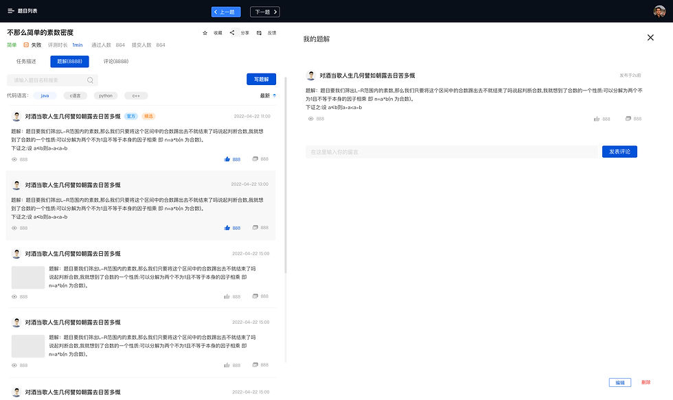
Added a feedback button on the question page.
Created a feedback page for users to leave comments on specific questions.
Created a list to track feedback results at the backend of the website.
Problems
Missing Practice Records and Saving Features: In testing with 10 new users, 7 noted the absence of practice records hindered their review process, while 9 found the lack of a saving feature inconvenient, as they couldn’t revisit unresolved questions.
Improvements
Added a way to save a question.
Created a page for users to view saved questions.
Added a practice record module on the homepage, displaying the number of pending, completed, and failed questions.
Created a detailed practice record list for users to review pending, completed, and failed questions.
Problems
Students Often Spend Too Long on the Question Page: I observed that students linger on the question list, scrolling for extended periods without starting, as they felt overwhelmed by the numerous categories and were unsure where to begin.
Improvements
Added a leaderboard showing the most popular questions, with filters to sort by weekly or monthly.
Introduced a "Start Randomly" feature, allowing users to quickly begin practicing without having to decide on a question.
Other User Experience Problems & Solutions
Problems
The homepage has too many topics without category labels.
Improvements
1. I categorised the topics into different modules, making it easier for users to browse and quickly find the type of questions they want to practice (e.g., Shell, Database, Algorithms).
Problems
The user experience after selecting a tag is not user-friendly.
Improvements
1. Differentiated the design of selected and unselected tags.
2. Added the ability to delete individual selected tags and a one-click option to clear all selected tags.
3. Included a counter to display the number of selected tags.
Problems
The question content page is overly complex and cluttered.
Improvements
1. Made the question text bold and placed it alongside the content for better readability and comprehension.
2. Moved the ‘save’ and ‘feedback’ buttons below the question for easier access.
Placed secondary information (difficulty, pass rate, participation) below the question.
3. Separated example code with background colours for a clearer layout.
4. Added a "Similar Questions" section at the bottom to help users quickly find related questions.
Problems
The programming editing area is not user-friendly.
Improvements
1. Added tags to filter by programming language, allowing students to choose their preferred language for solving questions.
2. Moved commonly used code editing buttons to the top-right corner for easier access.
3. Marked code errors in red and correct code in green for clear feedback.
4. Divided the content area into two sections: problem-solving text and code, with clear colour separation between the two.
5. Added a code copy feature.
Sketches Of The Design
After analysing the user research results, I drafted my proposed changes in sketch form and discussed them with my team members. Once my proposal was unanimously approved, we proceeded with the final design and development.


Final Designs


